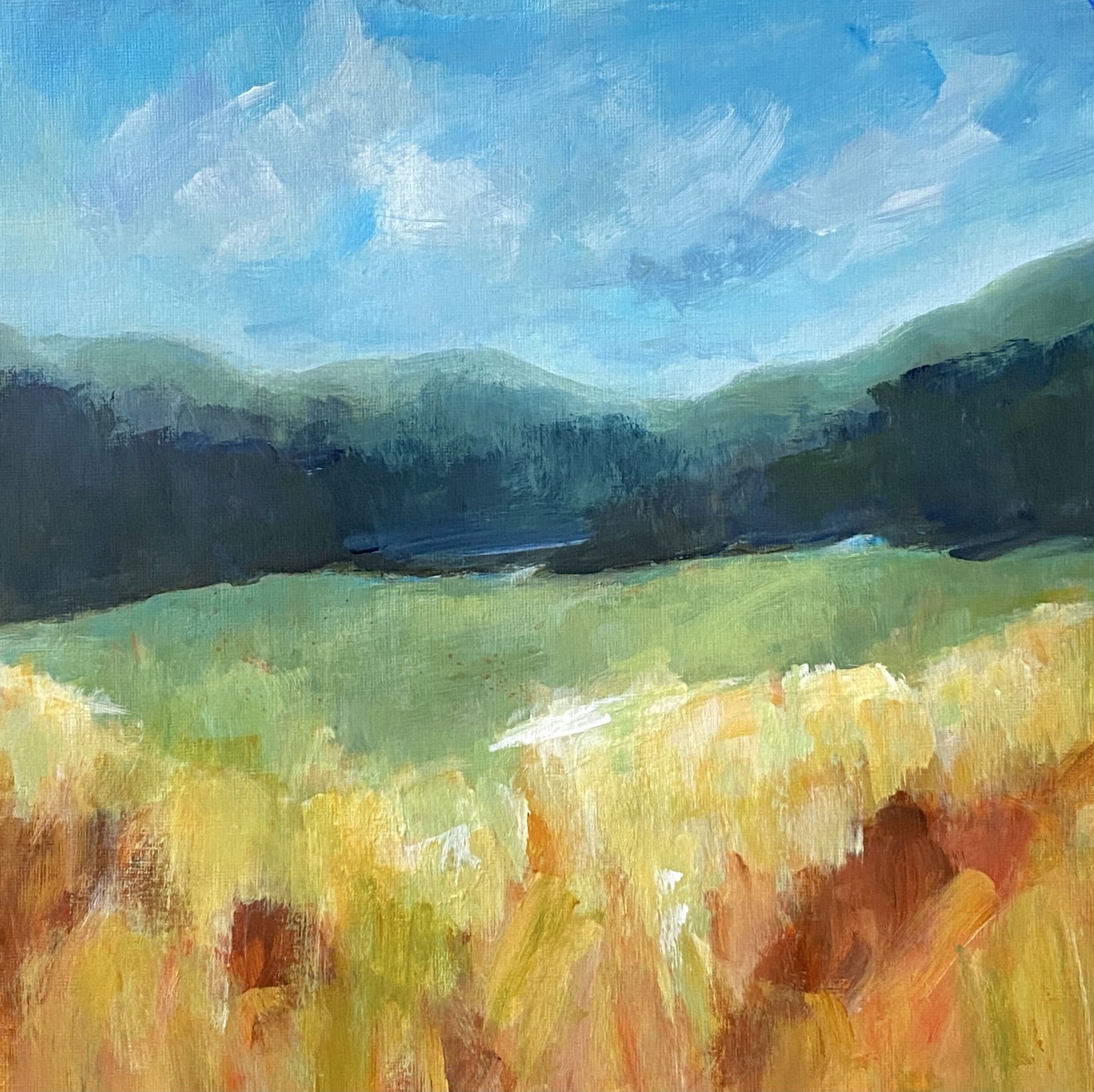
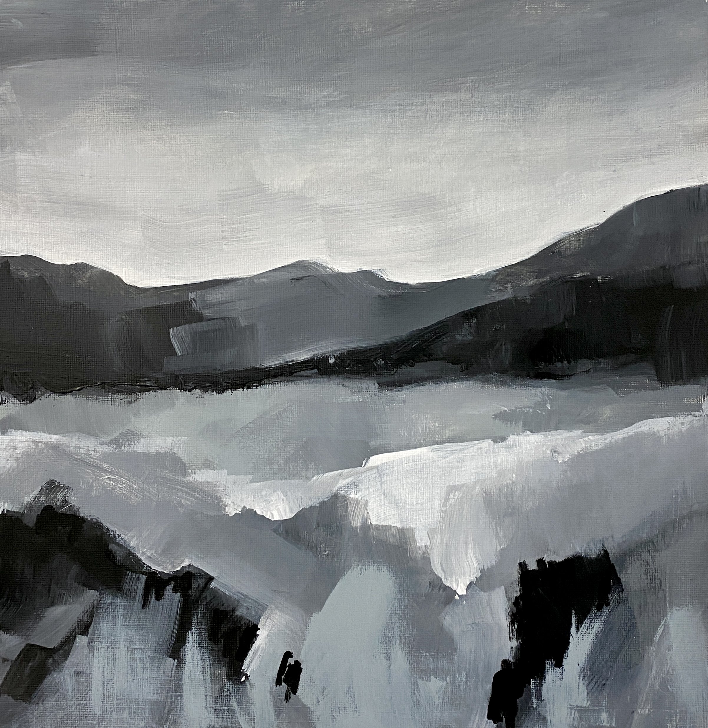
Three Tips to Improve Your Painting’s Color Values
My members will tell you that I always say:
Color gets the credit, but value does all the work!
All About Value
To create a successful painting, I find the best approach is to consider the painting as a value puzzle. It is an arrangement of light, shadow, and mid-tones. Value is the skeleton upon which the painting is constructed, while the colors add local interest.
Remember:
Value contrast is placing the darkest values next to the lightest values. The human eye is immediately drawn to a light element against a dark element. This creates a dynamic point of interest.
Gradations of value are also used to create the illusion of depth.
Areas of light, dark, and middle tones create a three-dimensional illusion of form to subject matter.
Tips for Leveling Up Your Value Game
Here are my tips for how you can get a sense of your painting’s values so you can adjust them for maximum impact:
Create a Black and White Study
It’s a great idea to do studies before you jump into a new painting. Studies can help you play with values, composition, and color. Doing studies helps you plan a better painting. Do one or several black and white studies of your painting (or a notan) so you can ensure that there is enough value contrast to excite the eye.
Pause While Painting
As you make progress on your painting, the values you decided upon in your black and white study may or may not be present. I recommend taking regular pauses to stand back and look at your painting. Try squinting your eyes so you focus less on details and more on the values.
Take a Snapshot
Our smartphones are never far from our reach. So put yours to good use by using a value study app (like See Value) or by taking a black and white photo of your painting as you work and as you approach completion. This is a great way to do a value check! Make adjustments in your painting as necessary.
Are You Seeing the Value?
I hope these tips have been helpful—what tip would you like to try?
Tell me in the comments!


